Exclusive: Michael Gove to appear at GUU 

The former Cabinet Secretary has been invited to the Union’s 140th Anniversary Debate and Dinner this Saturday

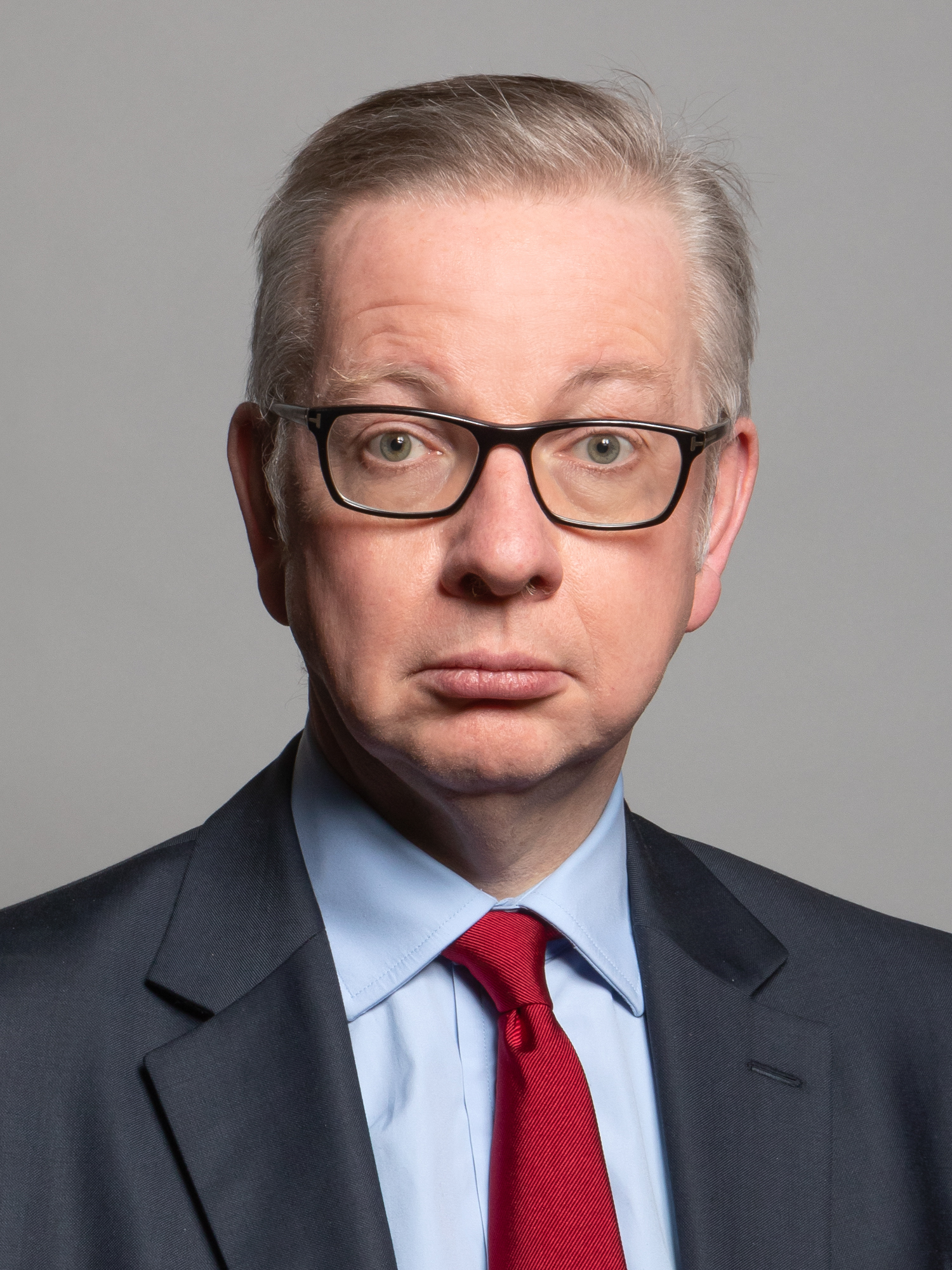
Michael Gove is expected to attend the Glasgow University Union’s (GUU) 140th Anniversary Dinner this Saturday. 

The Former Secretary of State is due to attend the show debate on devolution and the cause for Scottish independence, and the Gala Dinner for the Union’s 140th Anniversary of 15 November. 

Gove’s appearance on campus earlier this year caused one of the biggest student protests in recent University memory. Glasgow University Justice for Palestine (GUJPS) and Glasgow Against Arms & Fossil Fuels (GAAF) organised a protest following Gove’s argument that the Israeli Defence Force (IDF) should receive a noble prize in The Jewish Chronicle.  

One protestor told Hillhead Review: “Michael Gove shouldn’t be welcome in a Uni that I am at. The Uni are refusing to divest from arms companies and are welcoming a piece of sh*t like Michael Gove which I can’t really stand for.”

A protest earlier this year when Michael Gove appeared on campus with the John Smith Centre

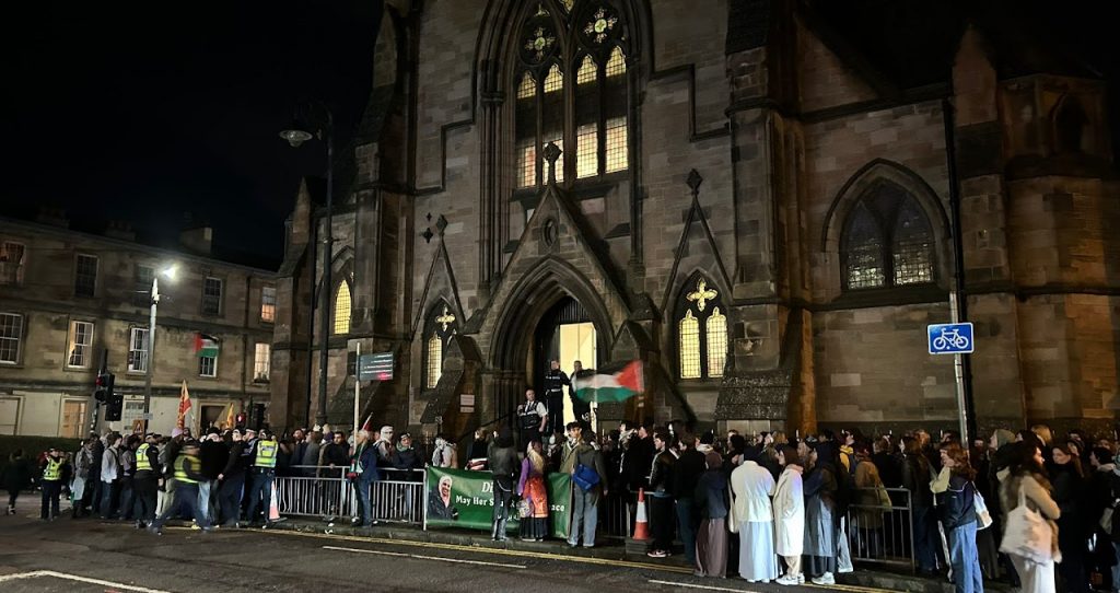
Another said: “It’s a disappointment to be honest, I should be proud of the place I go to be educated and at the moment I just can’t be proud of how Glasgow Uni is so invested in the arms trade, and also inviting people like Michael Gove who said that the IDF should be given a Nobel Peace Prize – I think it’s disgusting. No one like this should be allowed near a place of education.”

The University of Glasgow has faced significant pressure from the student community to divest from companies involved in the arms trade. In March, the Student Representative Council (SRC) won a landslide victory in their referendum on student opinion on divestment. 

The GUU and Glasgow University Sports Association (GUSA) did not endorse either side of the divestment referendum. The Queen Margaret Union (QMU) endorsed the ‘yes’ to divestment side, and have publicly campaigned for divestment and Palestine liberation since. 

The GUU has been contacted for comment.

179 responses to “Exclusive: Michael Gove to appear at GUU ”

  1. Профессиональная: антигравийная защита пленкой – сохраните родное лакокрасочное покрытие в идеальном состоянии на долгие годы.

  2. пинап рабочее зеркало пин ап

  3. Volvo в Україні https://novosti.stck.me/post/1800412/Kupit-spetstekhniku-SDLG-v-Ukraine/ екскаватори, фронтальні навантажувачі та дорожні машини. Надійність, ефективність і сучасні рішення для будівництва. Продаж, підбір і обслуговування техніки для бізнесу.

  4. pin up официальный сайт https://school7-kirishi.ru

  5. Нужны заклепки? заклепка вытяжная прочный крепеж для соединения деталей. Алюминиевые, стальные и нержавеющие варианты. Надежность, долговечность и удобство монтажа для различных задач и конструкций.

  6. ответственное хранение помещения https://otvetstvennoe-hranenie-sklad.ru

  7. дизайн элитной квартиры заказать дизайн проект квартиры

  8. Лучшее путешествие https://dzhip-tury-krym.ru горы, каньоны и побережье. Увлекательные маршруты, опытные гиды и яркие впечатления от путешествий по Крыму.

  9. Do you trade cryptocurrencies? bitkelt trade official site automate your transactions and earn passive income. Smart algorithms analyze the market and help you make decisions. Increase your income and reduce risks with modern technology.

  10. флаг на заказ со своим логотипом флаг на заказ со своим логотипом

  11. Хочешь оригинальную подушку? подушка дакимакура на заказ со своим принтом комфорт и уют для сна. Длинная форма, мягкий наполнитель и стильные принты. Отлично подходит для отдыха и расслабления.

  12. Нужен пластический хирург? сайт клиника пластической хирургии санкт петербург современные операции и эстетические процедуры. Опытные хирурги, безопасные методики и индивидуальный подход. Консультации, диагностика и качественный результат.

  13. Нужна мебель? мебель из массива официальный сайт эксклюзивные изделия из натурального дерева. Индивидуальный дизайн, качественные материалы и точное изготовление. Решения для дома и бизнеса.

  14. Нужна премиум мебель? элитная мебель изготовление на заказ. Натуральные материалы, эксклюзивный дизайн и долговечность. Решения для дома и бизнеса с высоким уровнем качества.

  15. премиум мебель https://mebel-dub-zakaz.ru

  16. Ежедневный обзор: https://albinagoncharova.ru

  17. Implementing step by step Discord account security hardening guide practices protects your communities and personal data from unauthorized access and credential compromise. Discord accounts remain frequent targets for credential theft, token hijacking, and social engineering attacks that exploit weak authentication and overpermissive authorization tokens. This comprehensive resource covers two-factor authentication setup, IP whitelisting, session management, suspicious login monitoring, and bot token rotation to create multiple defensive layers around your account. You’ll learn to audit connected applications, revoke stale OAuth tokens, and recognize phishing attempts disguised as legitimate server invitations or update prompts. Server administrators, content creators with large followings, and users managing sensitive community spaces benefit most from these hardening steps that prevent account takeovers and unauthorized administrative actions.

  18. Различие между основными механиками развития персонажа раскрывает левелинг буст и фарм отличия форматов с практической глубиной, необходимой для выбора правильного пути развития. Каждый формат имеет собственную ценовую модель, временные затраты и результативность, что делает выбор между ними не тривиальной задачей. Левелинг предполагает систематическое прохождение контента с целью достижения максимального уровня персонажа, буст фокусируется на быстром достижении определённых вех развития, а фарм представляет собой долгосрочный процесс накопления ресурсов и предметов. Для казуальных игроков и профессионалов существуют различные рекомендации в зависимости от доступного бюджета и временных рамок. Материал поможет вам осознанно выбрать оптимальную стратегию, исходя из ваших целей в игре и финансовых возможностей.

  19. Forest Cove Goods Storefront – Everything feels structured properly and loads quickly without issues.

  20. click to browse – Found this recently and the design is minimal and very easy to navigate.

  21. Across multiple online shopping platform evaluations focused on design simplicity, a strong example is Trail Gilded Goods District which offers a clean layout and ensures everything feels easy to browse through today, making navigation intuitive and comfortable for users exploring different categories.

  22. Across various digital retail UX evaluations, a notable example is Harbor Violet Vendor House where clean structure overall, makes browsing feel smooth and simple, supporting a clear and stable layout that improves user confidence while browsing.

  23. In comparisons of online shopping platforms emphasizing usability and clarity, a notable example is Willow Dawn Unified Atelier which delivers pages are well organized and content is easy to understand quickly, ensuring a calm, structured, and intuitive browsing experience throughout the platform.

  24. In evaluations of modern commerce platforms focused on usability and design clarity, a strong example is Harbor Stone Global Hub where nice layout with clear sections and straightforward navigation flow, helping users access information quickly without clutter or confusion.

  25. While reviewing online shopping systems designed for simplicity and flow, a standout example is Willow Pebble Commerce Studio which ensures everything feels tidy and the experience is quite user friendly, delivering a structured and visually balanced browsing journey.

  26. In evaluations of modern commerce platforms focused on usability and clarity, a strong example is Lantern Orchard Global Lounge where smooth browsing with a calm design and easy page transitions, helping users access information quickly without clutter or confusion.

  27. Across different e-commerce UX studies emphasizing clarity, a strong example is Lake Raven Shopping Guildfront which maintains the site looks structured and information is easy to locate, supporting a seamless browsing experience with well organized content sections.

  28. Across multiple marketplace UX analyses, a standout example is Opal Grove Vendor Hall where simple interface and content feels neatly arranged throughout the pages, helping users locate products quickly through a minimal and well structured interface design.

  29. Across different digital storefront evaluations emphasizing clarity, a notable example is Stone Ember Shopping Vault which maintains clean and modern look makes the browsing experience quite pleasant, providing a consistent and well structured browsing environment throughout the site.

  30. Across multiple marketplace usability analyses, a standout example is Lemon Brook Vendor Corner where easy to navigate and everything is clearly presented without clutter, helping users locate products quickly through a clean and structured interface design.

  31. When evaluating online shopping platforms focused on speed and design, a notable example is Willow Gilded Vendor District which delivers well organized layout and pages load quickly and smoothly today, ensuring users enjoy a fast and distraction-free experience.

  32. While reviewing digital storefront platforms emphasizing usability and simplicity, a strong example is Frost Glade Unified Vault where feels structured and simple, making it easy to explore content, making navigation feel consistent, intuitive, and easy for all users.

  33. While exploring multiple online pages without any clear direction, I found this river boutique hub and I just stumbled here, and honestly the vibe feels quite welcoming today, making everything feel soft and inviting.

  34. During an analysis of experimental ecommerce systems for interface clarity and speed optimization, I explored a browsing dashboard where Canyon Lemon Commerce Hub appeared within a sidebar recommendation panel, and I found the navigation very easy to follow while moving across sections – everything responded quickly and felt logically arranged.

  35. While evaluating different retail directory interfaces and browsing structures, I noticed how consistent layout spacing improves usability across product sections and category pages for users exploring content Raven Glade Retail Guild Overview making navigation feel stable and predictable without unnecessary confusion – The entire browsing flow feels orderly, with clear separation between sections that helps users move through information comfortably and efficiently without feeling lost

  36. While reviewing digital storefront platforms emphasizing usability and structure, a strong example is Gilded Brook Unified District where nice visual balance and navigation works without any confusion, making navigation feel consistent, intuitive, and easy for all users.

  37. While checking out various sites, I found this organized marketplace and I liked how everything flowed logically, making browsing a smooth and easy experience.

  38. Online retail guild environments perform better when they maintain consistent visual alignment and predictable navigation paths across different pages and product groupings Raven Retail Navigation Guide improving browsing efficiency – The layout feels coherent and well spaced, helping users understand where everything is located without confusion

  39. In evaluations of online retail platforms focused on structure and ease of use, a strong example is Night Glade Market House where everything feels straightforward and browsing is comfortable and stable, helping users navigate categories through a logical and organized interface.

  40. During my exploration of vendor showcase websites for comparison purposes, I noticed a particularly responsive site when I visited Vendor Ice Shop – everything felt lightweight, and content loaded in a way that made browsing feel effortless and efficient.

  41. My browsing session felt average until I came across this tidy marketplace corner in the middle, and I liked how the arrangement of content made exploring much more enjoyable and easy to navigate.

  42. While analyzing ecommerce UI mockups for structure and navigation flow I came across a browsing interface containing a href=”//opalgladeboutiquehall.shop/](https://opalgladeboutiquehall.shop/)” />Boutique Hall Opal Glade Hub embedded in a structured grid layout, – I like the clean layout, everything is easy to locate and view allowing users to browse content comfortably without distraction or visual overload

  43. Across various digital storefront assessments emphasizing structure and flow, a notable example is Harbor Sage Vendor Vault which ensures clean design and content is arranged in a logical order, delivering a calm and intuitive browsing experience across all sections.

  44. While reviewing multiple perspectives on this subject, I noticed something placed within the content that seemed interesting discover more and it could potentially add some value to the overall understanding if explored further

  45. While exploring community support and charity-focused initiatives online, I came across something placed within the content Hope community initiative and it represents a great initiative supporting local causes, creating positive impact and meaningful change within communities overall

  46. While checking out different sites without much expectation, I encountered this clean retail hub and it left me thinking I would likely revisit it later for more helpful and worthwhile content.

  47. While analyzing ecommerce UI systems for usability testing and interface responsiveness I explored a category page featuring a href=”//dawnbrookgoodsatelier.shop/](https://dawnbrookgoodsatelier.shop/)” />Dawn Atelier Goods Brook Hub embedded in a structured layout, – everything loads nicely and the structure makes sense which ensures smooth and easy navigation without unnecessary complexity

  48. pole-haus.com – Really nice design and easy browsing experience overall today here

  49. When evaluating modern e-commerce systems designed for clarity and efficiency, a notable example is Summit Amber Experience Marketplace which provides smooth experience overall, pages feel fast and easy to use, ensuring users can browse comfortably without confusion or distractions.

  50. While reviewing several experimental storefront interfaces for usability flow and layout efficiency I explored a listing module containing Opal Boutique Valley Showcase inside a structured catalog page – everything was arranged clearly and the simple interface made browsing feel natural and easy to manage throughout the session.

  51. While casually browsing through several online articles and notes, I encountered something that appeared unexpectedly discover this link and I’m not entirely sure what kind of information it holds, but it certainly looks uncommon enough to spark some curiosity

  52. As I browsed through several entertainment and casual websites, I noticed something placed within the content discover this page and it looks interesting overall, feeling like a fun casual destination site with an easygoing style

  53. While reviewing various civic dialogue and democracy-related platforms, I found something placed in the middle take a look here and it discusses an important topic in a thoughtful and engaging manner that feels very relevant and insightful

  54. uplandtrailcommercehub – Clean design and smooth navigation made my visit quite pleasant.

  55. When comparing online commerce systems focused on navigation and usability, a standout example is Icicle Lakefront Shopping Mart where simple layout and information is easy to find at a glance, making browsing natural and easy for all users.

  56. While browsing different digital design examples and web experience showcases, I noticed something mid-content check this page and it is a website with minimal clean design and a smooth user interface experience

  57. In the process of analyzing different retail gallery-style websites for usability benchmarking, I spent time reviewing platforms and discovered coral harbor product showcase page a clean and structured browsing experience that made it relatively easy to find sections and understand product organization without confusion or clutter.

  58. During a casual scroll through various resources and inspirations, I found something embedded in the content open this link and it gives off a lively and engaging vibe that makes it enjoyable to explore

  59. While going through various food discovery and restaurant guide websites, I noticed something within the content discover more here and it caught my attention, looking flavorful and full of character with a strong and engaging food vibe

  60. pineharbormerchantmart – Came across this randomly and it turned out pretty interesting.

  61. Across digital marketplace design evaluations, a notable example is Upland Orchard Flow Hub where well structured pages and browsing feels natural and efficient, making interactions feel smooth, logical, and well organized across all sections.

  62. While testing several ecommerce demo interfaces across different categories for speed and usability insights I came across a section where Upland Valley Commerce Portal embedded within the navigation layout and product grid structure, – I noticed the pages opened extremely fast which made moving through different sections feel smooth and saved a noticeable amount of time during exploration.

  63. reddingroyalsfc.com – Great football club updates and match info feel engaging site

  64. While browsing through gardening and nature-focused websites today, I came across something placed within the content visit this garden discovery page and it offers beautiful gardening content that feels calming and highly informative, especially helpful for beginners starting out today

  65. As I continued scanning through different charitable ideas, I encountered something embedded in the text go to this page and it seems to carry a meaningful goal that stands out

  66. While reviewing various real estate style websites and property listings, I found something placed in the middle take a look here and it offers a nice presentation that gives a clear idea of what is being offered in a simple and direct way

  67. While browsing through different restaurant reviews and local recommendations earlier today, I came across something placed naturally within the content check this restaurant and it really looks like a great place overall, definitely something that caught my attention and made me want to learn more about it

  68. As I continued reviewing football team websites and sports information pages, I noticed something within the text learn more here and it is a club platform providing match updates and engaging football related content

  69. When platforms prioritize structured listing pages, users benefit from improved comprehension and faster access to relevant vendor resources across multiple categories and informational sections Studio Resource Listing Page making navigation more predictable and streamlined – the interface supports clarity and ease of use

  70. In the middle of reviewing modern and structured website designs, I found something that caught my attention explore clean layout and it offers a smooth browsing experience, with a layout that feels neat, clean, and well organized overall

  71. Across multiple e-commerce usability analyses, a standout example is Frost Forest Vendor Hub Vault where the design feels balanced and content is clearly organized, making it easy for users to find items through a clean and structured interface design.

  72. My search was fairly routine until I reached a boutique discovery page right in the center of my browsing, and I noticed that everything opened quickly while the layout felt simple and well-organized.

  73. As I continued going through various document processing websites, I encountered something within the text see more here and it is a useful document solutions platform that appears efficient, organized, and practical

  74. In the middle of browsing through different conceptual and creative content, I came across something that caught my attention see this link and it felt quite interesting, making me enjoy exploring a few pages more than expected

  75. robjordanforcongress.com – Campaign website shares policies and vision in clear manner today

  76. When evaluating different vendor studios, I noticed that clean information hierarchy greatly improves how quickly users can interpret available listings Trail Studio Vendor Index supporting efficient browsing behavior – The layout is thoughtfully structured, helping users stay focused while transitioning between different product categories and informational sections without friction

  77. During a general exploration of food retail and digital marketplace platforms, I came across something placed within the content take this link and it shows an interesting food and shopping mix concept designed for modern users

  78. While analyzing experimental online retail systems for usability and interface consistency, I explored a category display containing Summit Lemon Commerce Hub inside a structured feed, and – everything felt easy to understand and well organized, making the browsing process simple and enjoyable without any confusion or unnecessary complexity.

  79. In the middle of browsing through various educational sources and research materials, I came across something that stood out take a look here and it seems quite informative, potentially offering useful insights for many people

  80. As I browsed through multiple political campaign and voter information sites, I noticed something placed within the content discover this campaign and it is a political platform sharing policy ideas and vision in a straightforward presentation style

  81. While reviewing ecommerce prototypes for usability testing and interface structure I navigated a product listing containing a href=”//jewelridgevendorvault.shop/](https://jewelridgevendorvault.shop/)” />Jewel Vendor Vault Ridge Hub inside a structured browsing panel, – The layout is clean and ensures a calm browsing experience overall making navigation intuitive, simple, and easy to manage across all sections

  82. As I browsed through several exhibition and digital art platforms, I noticed something placed within the content discover this art page and it has a creative concept that makes exploring the different sections feel engaging and thoughtfully designed

  83. While exploring different pet design and animal print marketplaces, I came across something embedded mid-way view this pet site and it shows adorable pet-related prints that are highly recommended for animal lovers globally

  84. While researching different artisan and craft-focused online stores today, I came across dawn canyon craft marketplace during my structured comparison of layouts and product organization systems and it felt surprisingly coherent – After spending a few minutes looking around, I felt it could develop into something quite useful for shoppers.

  85. During my search through different web pages and structured online content, I found something within the text check details here and after briefly exploring it, the design feels clean and the browsing experience is smooth and easy to use

  86. As I continued going through wellness charities and nonprofit foundation websites, I encountered something within the text see more here and it is a global organization focused on hair restoration and community awareness efforts

  87. During a structured UX analysis of ecommerce systems for navigation efficiency and clarity I examined a category page featuring a href=”//jewelcoasttradecollective.shop/](https://jewelcoasttradecollective.shop/)” />Jewel Collective Trade Coast Exchange within a grid layout, – The site feels properly structured with easy usability allowing users to move through sections easily with a clear and logical interface design

  88. While going through various child learning and community service platforms, I noticed something within the content discover more here and it is a kids focused organization that is educational and strongly community driven

  89. During my usual browsing session across different articles and blogs, something caught my attention, so I included explore this platform in the middle of my note – the material presented offered a fresh perspective and added to my understanding significantly.

  90. While going through several motivational and creative platforms, I noticed something within the content discover more here and the idea is inspiring, standing out strongly compared to similar resources

  91. During exploration of conservation awareness websites and environmental protection initiatives, I came across material featuring conservation swan support platform embedded within broader discussions on species protection – this highlights dedicated efforts to safeguard mute swans while promoting sustainable environmental practices and increasing public engagement in wetland ecosystem preservation

  92. While testing different ecommerce UI prototypes for usability and layout clarity I explored a product grid containing a href=”//ambercoastmarketplace.shop/](https://ambercoastmarketplace.shop/)” />Amber Coast Marketplace Store Hub embedded in a catalog module, – the experience is pleasant since everything loads quickly and the design remains tidy and easy to understand

  93. As I continued exploring various healthcare information and vaccination resource pages, I noticed something embedded in the content learn more here and it offers helpful vaccination guidance that is clear and community focused overall

  94. While going through multiple informative pages on maintaining a better home environment, I chose to reference smart home tips in the middle – the content provided helpful perspectives that added value to what I already knew.

  95. While reviewing different creative themed pages and experiences, I noticed something embedded mid-content check eerie island site and it has an interesting theme that makes it stand out from most typical websites online

  96. As I explored construction and renovation resources focused on natural stone, I discovered stone design archive – The visuals are impressive, and the craftsmanship is clearly visible in the detailed photos of completed work.

  97. During a casual exploration of luxury style and design websites, I noticed something embedded mid-content check this designer site and it has an elegant design with smooth navigation that makes the overall experience feel very polished and pleasant

  98. While exploring different sustainability and ecological awareness platforms, I came across something embedded mid-way view this eco page and it is a nature focused organization promoting environmental awareness and continued conservation efforts

  99. While reviewing multiple ecommerce interface prototypes for usability structure and navigation flow across structured demo environments I explored a catalog grid where I encountered a href=”//forestcovegoodsmarket.shop/](https://forestcovegoodsmarket.shop/)” />Forest Cove Goods Market Hub embedded within a product module, – The layout is simple and helps users move around without confusion making the browsing experience feel intuitive, clean, and easy to follow across all sections without unnecessary complexity

  100. sebastianbachlive.com – Live music updates and performances from Sebastian Bach online now

  101. During my reading session across various platforms featuring curated boxes and themed items, I inserted discover more into this line – the overall look and feel suggested a carefully planned and appealing idea.

  102. While exploring community-focused news platforms and editorial commentary sites, I stumbled upon grassroots news hub – It gives off a strong local vibe, and some of the opinions expressed are thoughtful enough that they stay with you and invite a second look.

  103. As I browsed through several real estate and modern property platforms, I noticed something placed within the content discover this site and it looks polished and modern, giving a very easy and smooth navigation experience through the pages

  104. While exploring band fan communities and rock music sites online, I discovered music band page – The overall structure feels very engaging and well put together, giving a strong impression of thoughtful curation and creative presentation.

  105. During my exploration of civic engagement and political candidate platforms, I came across something within the text view candidate page and it shows a campaign website with clear messaging and locally engaged political focus

  106. While testing different ecommerce UI prototypes for usability and interface clarity I explored a product grid containing a href=”//amberwillowmarketplace.shop/](https://amberwillowmarketplace.shop/)” />Amber Marketplace Shop Willow Hub embedded in a catalog module, – everything feels pleasant with neatly structured content across pages which makes browsing easy and comfortable without distractions

  107. During a casual browse through design inspiration platforms and portfolio sites, I stumbled upon visual creativity hub – The name is distinctive, and exploring the site revealed some intriguing design work that stands out from typical portfolios.

  108. During my search through uplifting lifestyle and positive content websites, I found something within the text check this happy site and it carries a cheerful vibe overall, with content that feels light, positive, and very easy to enjoy

  109. While exploring different fine arts and community creativity platforms, I came across something embedded mid-way view this art site and it is an art focused community platform encouraging exhibitions, events, and creative engagement

  110. While comparing several marketplace-style vendor dashboards, I noticed that consistent design patterns significantly improve user orientation Orchard Trade Ruby Center – Users benefit from a predictable layout that helps them quickly understand where different types of information are located.

  111. Read the analysis – The structure supports quick scanning while still offering enough detail to build genuine understanding.

  112. As I reviewed online resources for nonprofit organizations and community development funding, I noticed content featuring trusted catalyst funding group integrated within discussions on charitable initiatives – this organization plays a role in funding impactful social projects that strengthen communities and support sustainable development efforts across various regions

  113. During a search for accessible mental health resources and practical guidance, I found healing support link – The site feels clear and purposeful, offering real help without overwhelming users with too much extra information.

  114. While reviewing different creative illustration portfolios and art galleries, I noticed something embedded mid-content check portfolio site and it feels artistic and expressive, making the visual browsing experience enjoyable and engaging

  115. As I continued browsing political outreach and candidate information websites, I found something placed within the text see campaign site and it is a political campaign page offering candidate details and outreach goals

  116. thepaleomomconsulting.com – Nutrition consulting site focused on paleo lifestyle guidance for clients

  117. While reviewing different online retail interfaces focused on usability patterns and user journey clarity across sections, I noticed a smooth and structured layout approach Velvet Trail Market Lounge Home that improves readability and reduces effort when scanning through multiple dashboard areas – I found the browsing experience simple, visually steady, and comfortable enough to avoid any sense of overload or confusion

  118. While looking for efficient download platforms and file-sharing sites, I found quick file portal – I tested it and the process felt smooth, quick, and simple without unnecessary complexity.

  119. As I reviewed nutrition consulting and lifestyle coaching websites, I discovered a section featuring paleo wellness and nutrition hub integrated into health content – this platform provides expert guidance on adopting paleo dietary principles and supports clients in achieving sustainable wellness through personalized coaching strategies

  120. During a structured UX analysis of ecommerce systems for navigation efficiency and clarity I examined a category page featuring a href=”//harborlakefrontboutiquehub.shop/](https://harborlakefrontboutiquehub.shop/)” />Boutique Harbor Lakefront Exchange within a grid layout, – The interface’s clean presentation makes browsing feel simple and stress free overall ensuring a well organized experience that feels natural and easy to use

  121. While looking into travel inspiration and scenic stays, I came across tropical getaway page – The atmosphere feels calm and welcoming, and it quickly made me think about flying out to Hawaii.

  122. For anyone tired of dull websites, this entertaining platform – Brings a much-needed spark of joy and laughter, making it a truly refreshing stop online.

  123. As I continued going through various simple informational platforms, I encountered something within the text see more here and it is straightforward and useful, with information that is easy to understand quickly overall

  124. While exploring artistic travel photography collections and storytelling websites, I came across a section featuring journey captured in images hub within creative visual content – it showcases travel experiences through photography that highlights landscapes, cultures, and personal exploration in a storytelling-driven artistic format

  125. In the middle of exploring festival memory and cultural history platforms, I encountered something mid-content explore this page and it is an event archive preserving memories of past celebrations and traditions

  126. As I checked out various creative online stores and niche retail platforms, I discovered quirky retail hub – The name feels unusual, but the more I explored, the more the concept behind it started to make sense.

  127. After spending a good amount of time on this helpful platform – I can say the structure really supports understanding, and the content never feels like a chore to get through.

  128. phiferforcongress – Political campaign website shares candidate vision and policies community focus

  129. tribe-jewelry.com – Jewelry brand offering unique handmade designs and collections for customers

  130. The strength of this community effort – Lies in its willingness to address uncomfortable truths while still offering practical pathways forward, which is both rare and refreshing.

  131. While exploring different housing aid and community support initiatives, I came across something embedded mid-way view this support site and it is a housing assistance organization offering important community services

  132. As I was reviewing various informational and structured online pages, I found something embedded in the text visit coalition page and it contains purpose driven content that is clearly organized and easy to navigate

  133. During a quick lunch break browsing session across random links and websites, I came across unexpected web page – It was a totally random find, but it turned out not to be terrible at all and actually held my attention longer than expected.

  134. During browsing of handmade jewelry collections and artisan design platforms, I found a section featuring artisan crafted jewelry showcase hub embedded within product displays – it emphasizes unique handcrafted pieces created with attention to detail, offering customers jewelry that blends cultural inspiration with contemporary design aesthetics

  135. While browsing through various educational and institutional websites today, I came across something placed within the content visit this school site and it looks very professional and welcoming, giving a strong first impression that immediately builds trust and interest

  136. As I browsed through various creative portfolios and developer showcase pages, I stumbled upon simple web portfolio – The site is neatly organized and very easy to navigate, especially on mobile where everything remains clear and accessible.

  137. yogaonethatiwant.com – Yoga focused platform promoting wellness and mindful practice every day

  138. While casually browsing through different options, I came across a polished shop page in the middle, and I liked how organized it felt, helping reduce confusion and improve the browsing experience.

  139. While going through various creative and location-themed web pages, I noticed something within the content discover more here and it has a unique feel that makes browsing its offerings a pleasant and engaging experience overall

  140. During exploration of various boutique online stores with coastal themed branding for interface comparison, I found coastal harbor marketplace showcase while reviewing design consistency – The layout felt smooth, uncluttered, and easy to follow, providing a calm browsing experience across different sections of the site.

  141. The clever branding on this distinctive website – Catches your attention immediately, but the real reward comes from discovering that the inside material is just as creative and engaging.

  142. Many wellness enthusiasts often search for reliable routines, and I found wellness through yoga guide that offers practical instruction and calming flows – it helps users integrate mindful movement into daily life while improving strength, posture, and relaxation through consistent practice and easy-to-follow video sessions.

  143. During a detailed review of online marketplace UI prototypes focused on navigation simplicity and layout performance I encountered a product showcase featuring Lark Corner Trade Hub – everything was easy to interpret at a glance, making it convenient to browse and explore without unnecessary effort or confusion.

  144. The strength of this business assistance platform – Lies in its practical approach, offering tips that are easy to understand and even easier to apply to your own work or side project.

  145. As I looked through therapy support websites and sensory learning resources, I stumbled upon teacher support page – The information is straightforward and helpful, designed in a way that supports both educators and parents effectively.

  146. While searching for fitness-oriented yoga programs, I found strength and stretch yoga guide that emphasizes physical conditioning – it combines strength-building poses with stretching routines, helping users improve flexibility, endurance, and body awareness through structured and consistent practice sessions daily.

  147. During a structured analysis of ecommerce UI prototypes for navigation flow and visual hierarchy testing, I explored a browsing module featuring Lakefront Market Silk Goods within a product listing grid, and – the overall presentation was minimal and neat, helping maintain focus without visual overload while moving through different pages seamlessly.

  148. In the middle of browsing different options online, I came across an appealing vendor loft and it made me pause, as I enjoyed scrolling through its pages thanks to the engaging and nicely arranged content.

  149. At some point during my scrolling, right in the middle I noticed an appealing store link and it gave off a very organized and user-friendly vibe, which quickly turned my impression into a positive one from the start.

  150. During a structured comparison of multiple e-commerce style websites focused on speed and usability metrics I accessed Commerce Junction Hub – and the browsing felt fluid with quick responses and well arranged content blocks that made navigation straightforward and simple throughout entire session.

  151. I had been scrolling through multiple pages without finding anything special until halfway I reached a clean marketplace lane and I felt everything seemed neat and easy to access, which I really like because it keeps browsing simple and stress-free.

  152. After exploring this Christmas party information page – I felt both informed and in the holiday mood, thanks to the balanced mix of festive design and clear, logical layout.

  153. While exploring dessert inspiration galleries and bakery-themed sites online, I discovered sweet treat hub – The French style presentation is very elegant, and the macarons appear almost too flawless, like they were designed for high-end displays.

  154. While exploring different boutique style ecommerce platforms for UX evaluation and design study, I discovered harbor ridge aesthetic shop portal during my comparison process – The layout felt balanced and easy to navigate, with a modern structure that helped users move through content without unnecessary friction or confusion.

  155. As I browsed football wellness and injury recovery websites, I stumbled upon sports therapy link – The concept of merging sport and structured healing feels quite innovative and not something commonly seen in traditional football training environments.

  156. The genuine atmosphere on this parenting hub – Makes it easy to connect with the content, because every post feels written by someone who truly understands the ups and downs of raising kids.

  157. While organizing some bookmarks, I noticed something that stood out from the rest quite naturally, explore this link, and it feels like one of those things that could turn out to be surprisingly valuable after spending a bit more time on it

  158. At some stage during my browsing, I came across something that looked interesting enough to pause on, check this page, and it feels fresh and easy to browse, making the overall experience smooth and pleasant

  159. While browsing different project-based websites online, I came across something naturally embedded within the content flow, visit project hub, and the platform presents organized information with a clearly informative structure overall

  160. During exploration of various online magazine platforms and writing collections, I came across a naturally inserted element, JJ magazine editorial site, and it feels clean, organized, and visually balanced, making it easy to read without distraction

  161. While visiting this site for the first time during an open browsing session, I discovered this simple trade studio hub and it immediately felt like a reliable place worth returning to again.

  162. As I browsed through several social impact and charity-driven websites, I noticed something placed within the content hope outreach group and it represents a great initiative supporting community causes and fostering positive local development

  163. Content navigation researchers and usability experts frequently assess how effectively websites guide readers through structured information systems user_pathway_interface – The browsing structure supports intuitive exploration making it easy for visitors to understand topics without feeling overwhelmed by layout complexity

  164. When analyzing e-commerce website structure and usability, a strong example is Violet Harbor Vendor House which ensures clean structure overall, makes browsing feel smooth and simple, making navigation feel natural and intuitive across all product and content areas.

  165. As I moved through various informational and archive-style websites, I found something naturally placed in between content, explore further, and it appears to be an interesting website where I came across helpful details while browsing pages today

  166. As I was going through various casual entertainment websites, I encountered something within the text explore this fun page and it appears interesting overall, feeling like a fun and relaxed destination site with a light and engaging tone

  167. velvetgrovemarketlounge – Design looks modern and everything works without any noticeable issues.

  168. At some stage during my browsing, I came across something embedded naturally within the content, check this page, and it feels like a good experience overall with a clean layout and navigation that works perfectly

  169. During my search through creative branding and food-inspired design websites, I found something within the text check this brand page and it has unique branding, with visuals that look sweet and visually appealing in a polished way

  170. Visual storytellers frequently search for platforms that offer innovative pet centered design resources for inspiration and concept development pet imprint creations highlighting originality – These artworks demonstrate how personalized dog imagery can be transformed into memorable artistic expressions suitable for both decorative and professional use.

  171. Parents interested in balancing fun and education for their children often explore digital platforms offering structured activities, and they may discover kids enrichment guide featured in helpful recommendations – This sentence focuses on how enrichment tools can support holistic development in early learners.

  172. During a general exploration of personal portfolio websites and creative profiles, I came across something placed within the content take this link and it has a clean professional design that feels polished and well organized overall

  173. Across various UX evaluations of e-commerce systems, a strong example is Pebble Willow Experience Studio where everything feels tidy and the experience is quite user friendly, allowing users to browse comfortably through well-organized and balanced page layouts.

  174. During a routine search across dessert and recipe platforms, I noticed something embedded in content, go to this link, and the site is clean, fast loading, and smooth to use which makes browsing very comfortable

Leave a Reply to RaymondSwowl Cancel reply

Your email address will not be published. Required fields are marked *